Our long-awaited new website is here! It’s in beta mode, which means that it’s the first draft and we’re accepting feedback. Please email us to let us know what you think! Feel free to let us know anything you think would be helpful for us to hear. Here are some questions we have, in case you don’t know where to start:
- Do you like how it looks in general?
- Do you think the aesthetic feel is consistent with the Photo Review’s aesthetic values?
- Are there any aspects that seem like they aren’t working properly on your browser or computer?
- Is there anything you think is missing from the new website?
- Are there any other technological updates you think the Photo Review should prioritize?
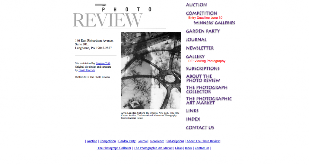
In case it helps, here is what the old website looked like. (Now there’s some fodder for a future #tbt tag, huh?)
 Thanks for helping the Photo Review be a technologically current and resilient arts business!


Leave a Reply
You must be logged in to post a comment.